
Context
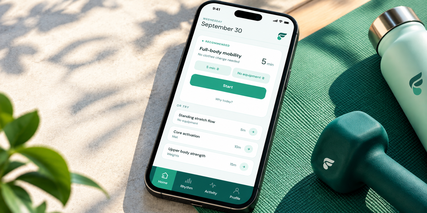
Most fitness apps are built for the person who never stops. FitFuel is built for everyone else. It’s a fitness app concept that bends to a week that won’t hold still, so one missed stretch doesn’t end the routine.
For this project I was the sole UX designer and researcher, taking it from open question to test-ready design in four weeks, September to October 2026. AI did the heavy lifting of research and synthesis. I made the decisions.
The Challenge
FitFuel has to adapt to the gap without ever judging it. The plan has to change because of the gap, but users punish any judgement of the gap.
Nothing dramatic. Just adjust. Like, don’t say anything about it. Don’t make me explain.
Don’t say, ‘welcome back!’ in a way that highlights the absence... Adjust without making a fuss.
The Approach
I started by tying every research question to a product decision it could change. If the answer wouldn’t change what we built, I didn’t ask the question.
- Research Question 1
- What actually breaks consistency for people who’ve already tried fitness apps — time, motivation, confidence, cost, or health?
- Decision That Would Change
- Whether FitFuel is fundamentally a scheduling/planning product, a motivation/accountability product, a confidence-rebuilding product, or a health-adaptive product — each implies different IA, AI use cases, and success metrics.
AI assisted in the volume work. Perplexity pulled competitor data across seven products. Claude drafted the synthesis, checked claims against the transcripts and proposed labels. Gamma turned findings into a report. I chose the framing and what was kept vs. thrown out.
I wrote pass/fail criteria into the design brief, then built every test task to prove or break one of them.
The Research and Insights
I talked to five people who had used fitness apps and stopped, plus two trainers, and audited seven competitors. I expected to hear about time. What I heard about was what happens after a disruption.
4/5 had a single disruption end their routine.
For four of the five, one thing like a knee flare, a work crunch or losing their running group ended the routine, because the plan had no smaller version to fall back to.
4/5 overcorrected when they came back.
Coming back was just as hard. Four of the five overcorrected when they returned. They planned five workouts and did none, or did one long make-up session and were sore for three days. Trainer 1 sees the same pattern with clients.
2/5 + both trainers found cheerleading copy condescending.
Tone mattered more than I expected. Nobody wanted to be cheered on. “Crush it” and “go girl” came across as condescending to two participants and both trainers. They wanted the app to be quiet and treat them like adults.
The Design
The design focuses on the experience of returning after a lapse by reducing friction and frustration, giving the user a one-click way to start their workout.
I considered presenting the user with a quick “how do you feel today” check-in before bringing them to their Today page, but decided to incorporate it elsewhere because it added friction to the start of their return.
View the Prototype (opens in a new window)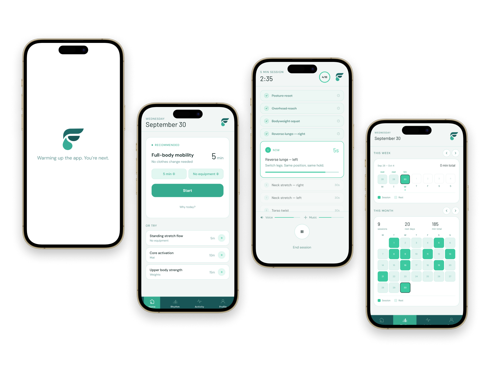
The Validation
I tested the return flow with six people coming off a real lapse, against the six acceptance criteria set in the brief. Here’s what the test answered:
- 5 minutes feels like a real session, not a demotion.
- Silence about the gap was appreciated.
- One click to start a workout reduced frustration upon return from lapse.
The Outcome and Recommendations
We shipped a product that focuses on retention and ease of re-entry. The trade-off was we don’t have immediate feedback from the user upon their return about how they are feeling.
Recommended next steps
- Place the wellness check feature after the user completes their first workout after returning.
- Recruit at least 2 people with no athletic history.
- Run the lapse test on 3 competitors. Use their apps for a week, stop 10 days, return, and log every message and plan change.
- Interview 3 to 5 trainers or adaptive coaches on whether they would prescribe FitFuel, and what they would need.
The Reflection
What I learned
I went in expecting a time problem and found a re-entry problem. The users looked different on paper, but they all broke at the same moment. Once I saw that, I stopped designing for personas and designed for that moment.
What I’d do differently
Recruit wider on day one. All five participants had an athletic past. That’s likely why “beginner” stung so hard, and it means my core finding may only hold for former athletes. I’d put two people with no sporting history in the first round.
What changed in my practice
AI makes it easy to be fast, but I treat its output as claims to check, not drafts to polish. I also write the pass/fail criteria before begin any work on actual screens.